Website DesignHeadlines
You might be trying to:
Designing Your WebsiteAccording to the website 10 Rock Solid Layout Designs, there are several very easy to follow guidelines that you can use to create solid layouts that work for any number of cases. These principles include choosing and sticking to an alignment, structuring your white space properly and highlighting important elements through size, positioning, etc.
It’s true that the pages we marvel at the most are often from the peculiar sites that break the mold, but your average client just wants something usable, clean and professional. In this article we’re going to take a look at very common layouts that you can find on countless sites across the web. Notice that the way these sites are styled, meaning the colors, graphics and fonts, is unique, but the basic structure of the sites themselves are based on tried and true methods for laying out a webpage. We’ll emphasize this by first showing you a simple silhouette of the layout so that you can project your own thoughts and designs onto it, then we’ll follow it up with one or two examples of real sites that use the layout. These layouts are possible on Weebly.com depending on which theme you choose (a top navigation bar or a sidebar). You can create boxes in several programs and then insert them into the image slot on your webpage. If you are adventurous and choose to use Wix.com, many of these layouts are already done for you. Feel free to mix, match, create and modify throughout your site to meet your specific needs. Three Boxes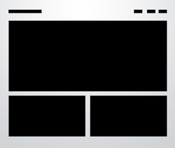
This is probably the most simple layout on the list. In fact, you’ll be tempted to think that it’s far too simple to ever fit your own needs. If this is the case, you’ll be surprised if you really put some thought into how versatile the arrangement really is.
The three boxes layout features one main graphic area followed by two smaller boxes underneath. Each of these can be filled with a graphic, a block of text or a mixture of both. To do this on Weebly once signed in to the Weebly editor, click on the [Design] tab to choose a background theme with a top navigation bar. Then go to the tab [Pages] at the top, make sure the name of the page you wish to modify is in the page name box and click on the page layout with no content area and save the setting. Click on the [Elements] tab at the top of your Weebly editor and drag and drop the 'picture' icon onto your page and a picture box will appear. You may click that to upload a photo from your computer or with a URL. To get the appropriate dimension you may have to resize your photo on any photo editor (Photoshop) etc, and the photo area does give the opportunity to fit your photo and add some effects. You can also click on 'multimedia' and drag and drop a slideshow (do the one with no thumbnails) and upload photos that will rotate instead of a stagnant box. It would be best to size all the photos the same for the slideshow. Once you have uploaded your oblong photo or slideshow, grab the 'multiple columns box' found on the [Elements] tab of your Weebly editor and drag and drop it under the oblong photo. Grab and drop either a 'picture' or 'paragraph' box in each square (a yellow line will appear, make sure it fits inside of your box) and either upload another smaller photo or add text and hit the orange 'publish' button to save. The smaller photos along the bottom can lead to an actual page inside your website by linking it (I can help you with that). For example, if you are doing political cartoons you could put a photo of a cartoon 1980-1990s in box 1 on the bottom and 2000-beyond in box 2, then we could link each photo to a page inside of your website where you analyze the different cartoons. You can also leave the main page header on and either write in the box or add photos. 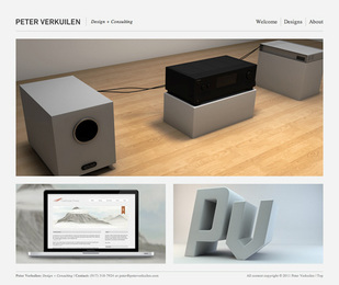
Five Boxes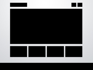
The five boxes layout is simply an evolution of the three boxes layout. All of the same logic applies, it’s just been modified to hold even more content. It could easily be four boxes as well, it just depends on what you want to showcase. It also makes it look like you put a little more effort into the design!
Obviously, as you add to the layout, the secondary items become smaller and smaller so for most uses, five boxes is probably going to approach the limit. This design is possible on Weebly with all of the above steps except once you have dragged and dropped the 'multiple columns' format under your oblong photo, it gives you a choice of numbers of columns, select 4 and drag and drop a photo box and upload a picture in each. This one either has text along the bottom which is possible by dragging and dropping a 'paragraph box under you 4 columns and typing in text or by dragging and dropping a 'picture' icon and editing a long thin photo that will fit the length of your page. 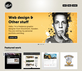
Fixed Sidebar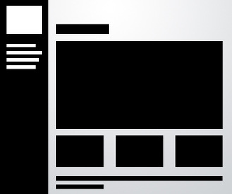
Thus far all the sites that we’ve seen have had a top-side horizontal navigation. The other popular option is of course a vertical navigation, which lends itself to creating a strong vertical column on the left side of the page. Often this is a fixed element that stays where it is while the rest of the page scrolls. The reason for this is so the navigation can stay easily accessible from any point in the site.
With Weebly editor click the [Design] tab and pick a design with a side navigation bar instead of a top navigation bar and follow similar steps as above. This has 3 columns along the bottom. 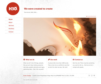
Advanced Grid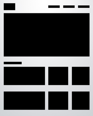
Many of the layouts that you’ll see in this article adhere to a pretty strict grid alignment. However, for the most part, they don’t simply suggest a page full of uniform thumbnails. For instance, the layout below mixes up the size of the images to avoid redundancy.
As with the three boxes example, there’s one primary graphic heading up the page. This is followed by a simple twist on the idea of a uniform grid of thumbnails. The space would allow for a span of four squares horizontally, but instead we’ve combined the first two areas so that the left half of the page differs from the right On Weebly this is possible by directions in the first 3 box model displayed above with a top navigation bar, but when pulling the 'multiple columns' box down, you divide it into 3 and adjust the columns with one a little larger than the other two. You the pull a second 'multiple column' box either under or on top of the first one and pick 3 columns again and adjust the size to match the first one. In the bigger box the designer dragged and dropped a 'picture' icon into the top box and a 'paragraph' icon below it. 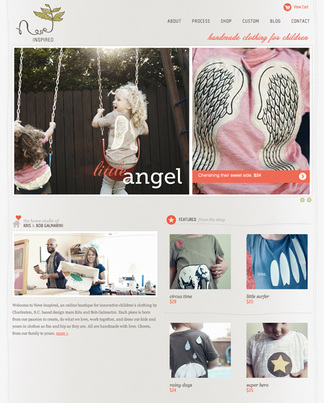
In the Wild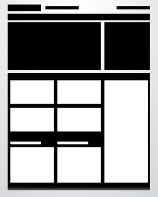
This one can be really hard to wrap your mind around until you see some live examples. The first is a showcase of art and culture. That description alone tells us that the content is going to be all over the board, and indeed we see that the page is filled with Twitter feeds, photos, lists, images and more.
However, it all fits tightly inside the grid that the designer has established. This layout is easily extendable so that no matter how much you throw at it, the overall appearance should remain fairly logical and uncluttered as long as you format and arrange your content properly. With Weebly follow the explanation again accompanying the designs above, just stack and adjust 3 rows of 'multiple columns.' 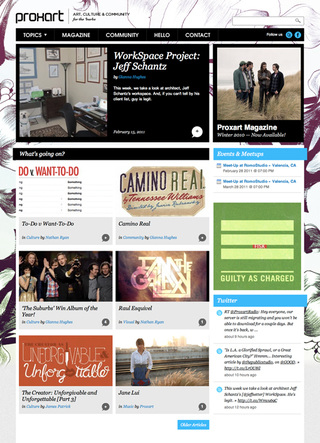
|
Adapted from Paula Thompson
